Dizzie Landing Page
UX/UI
B2C
sustainability
2022
Dizzie is an online shop focusing on low-waste and refillable products.
This project involved collaborating with Dizzie’s Product Team to improve the customer journey and redesign their website during a major rebranding effort. My primary objectives were to assess and optimise the site’s navigation and redesign the landing page to better align with the brand’s goals and user needs.


Goals
Design an optimised landing page aligned with new branding and user expectations
Validate areas to prioritise for development
Design an optimised landing page aligned with new branding and user expectations
Validate areas to prioritise for development
Design an optimised landing page aligned with new branding and user expectations
Validate areas to prioritise for development
Results
Delivered a clean, vibrant page aligned with brand identity, highlighting sustainability and product offerings
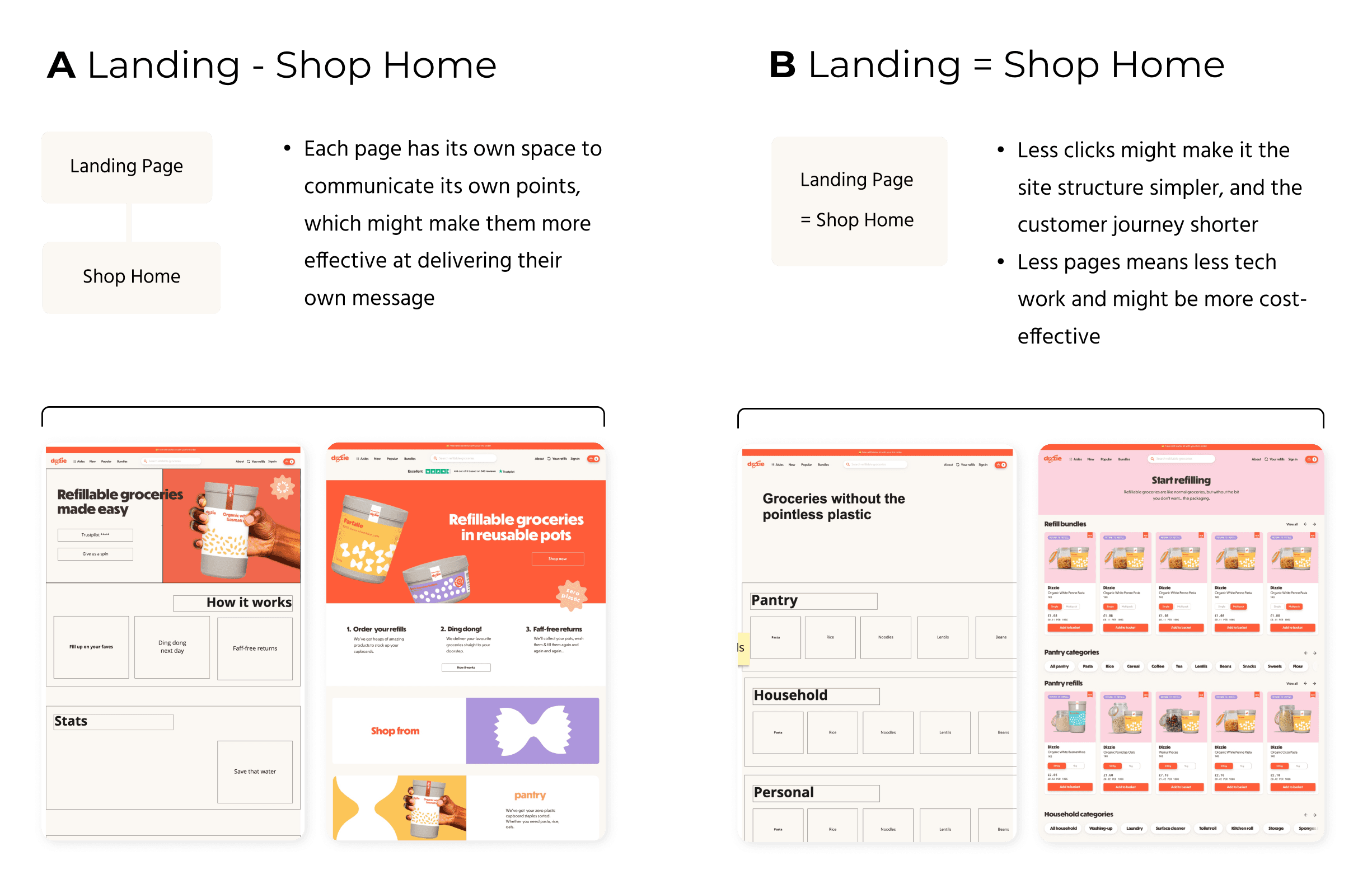
Suggested consolidating the landing page with the shop home to shorten the customer journey and save development time
Improved communication of the service’s unique value proposition (UVP) with optimised imagery and visual aids
Process
Alignment
Collaborated with the CPO and Marketing Lead to establish clear goals:
Communicate UVP: sustainability, trustworthiness, and how the service works.
Visual Identity: align with branding—bright, clean, and high-quality.
Usability: easy navigation and seamless user flow.
Testing for Optimisation
Explored two potential approaches:
Separate Landing Page: Dedicated space for UVP and branding.
Merged with Shop Home: Shortened user journey and reduced development time.
Tested both approaches to evaluate clarity, efficiency, and user preference.

Key Findings & Solutions
Users misunderstood the product offering due to unclear hero imagery → Coordinated with Marketing Manager to capture images showing both the product and packaging.
Users took longer than 10 seconds to understand the service. → Created small illustrations to explain the service in the "How It Works" section.
Refinement
After validating the structure, iterated on the design with feedback from Dizzie's CPO to balance vibrant branding with a clean, high-end aesthetic.
Reflections
Metrics for Further Optimisation
While the redesign contributed to better usability and alignment with brand goals, the impact of individual changes was difficult to isolate due to the simultaneous rebranding.
Personal Growth
Problem-solving within constraints: Tight timelines and budgets required creative, pragmatic solutions.
Cross-team collaboration: Worked closely with Marketing and Product teams to align visuals, copy, and branding.
Testimonial
“[Nienke] has a knack for gleaning critical insights from research that helped our team make better decisions. She’s a brilliant, versatile member of a team, and I’d hire her again in a heartbeat.”
— Danny Blackman, Dizzie CPO
Alignment
Collaborated with the CPO and Marketing Lead to establish clear goals:
Communicate UVP: sustainability, trustworthiness, and how the service works.
Visual Identity: align with branding—bright, clean, and high-quality.
Usability: easy navigation and seamless user flow.
Testing for Optimisation
Explored two potential approaches:
Separate Landing Page: Dedicated space for UVP and branding.
Merged with Shop Home: Shortened user journey and reduced development time.
Tested both approaches to evaluate clarity, efficiency, and user preference.

Key Findings & Solutions
Users misunderstood the product offering due to unclear hero imagery → Coordinated with Marketing Manager to capture images showing both the product and packaging.
Users took longer than 10 seconds to understand the service. → Created small illustrations to explain the service in the "How It Works" section.
Refinement
After validating the structure, iterated on the design with feedback from Dizzie's CPO to balance vibrant branding with a clean, high-end aesthetic.
Reflections
Metrics for Further Optimisation
While the redesign contributed to better usability and alignment with brand goals, the impact of individual changes was difficult to isolate due to the simultaneous rebranding.
Personal Growth
Problem-solving within constraints: Tight timelines and budgets required creative, pragmatic solutions.
Cross-team collaboration: Worked closely with Marketing and Product teams to align visuals, copy, and branding.
Testimonial
“[Nienke] has a knack for gleaning critical insights from research that helped our team make better decisions. She’s a brilliant, versatile member of a team, and I’d hire her again in a heartbeat.”
— Danny Blackman, Dizzie CPO
Alignment
Collaborated with the CPO and Marketing Lead to establish clear goals:
Communicate UVP: sustainability, trustworthiness, and how the service works.
Visual Identity: align with branding—bright, clean, and high-quality.
Usability: easy navigation and seamless user flow.
Testing for Optimisation
Explored two potential approaches:
Separate Landing Page: Dedicated space for UVP and branding.
Merged with Shop Home: Shortened user journey and reduced development time.
Tested both approaches to evaluate clarity, efficiency, and user preference.

Key Findings & Solutions
Users misunderstood the product offering due to unclear hero imagery → Coordinated with Marketing Manager to capture images showing both the product and packaging.
Users took longer than 10 seconds to understand the service. → Created small illustrations to explain the service in the "How It Works" section.
Refinement
After validating the structure, iterated on the design with feedback from Dizzie's CPO to balance vibrant branding with a clean, high-end aesthetic.
Reflections
Metrics for Further Optimisation
While the redesign contributed to better usability and alignment with brand goals, the impact of individual changes was difficult to isolate due to the simultaneous rebranding.
Personal Growth
Problem-solving within constraints: Tight timelines and budgets required creative, pragmatic solutions.
Cross-team collaboration: Worked closely with Marketing and Product teams to align visuals, copy, and branding.
Testimonial
“[Nienke] has a knack for gleaning critical insights from research that helped our team make better decisions. She’s a brilliant, versatile member of a team, and I’d hire her again in a heartbeat.”
— Danny Blackman, Dizzie CPO
Deliverables
Redesigned Landing Page: a visually appealing and user-friendly landing page that effectively communicates the brand's unique value proposition
High-Fidelity Mockups: detailed mockups showcasing the layout, typography, and colour palette of the redesigned page
Redesigned Landing Page: a visually appealing and user-friendly landing page that effectively communicates the brand's unique value proposition
High-Fidelity Mockups: detailed mockups showcasing the layout, typography, and colour palette of the redesigned page
Redesigned Landing Page: a visually appealing and user-friendly landing page that effectively communicates the brand's unique value proposition
High-Fidelity Mockups: detailed mockups showcasing the layout, typography, and colour palette of the redesigned page
Before & After
Compare versions below by clicking and sliding your over the images!

