Kaufland Seller Sign Up
UX/UI
B2B
e-commerce
2024
During my time at Kaufland, I was tasked with updating the Seller Landing Page as part of a broader initiative leading to the launch of two new sales channels: Poland and Austria. The project required careful management to meet a hard deadline, balancing the page update with my other ongoing responsibilities. I worked closely with teams from Front-End Development, Product Management, Legal, and Media to ensure the page aligned with Kaufland’s goals and branding.
During my time at Kaufland, I was tasked with updating the Seller Landing Page as part of a broader initiative leading to the launch of two new sales channels: Poland and Austria. The project required careful management to meet a hard deadline, balancing the page update with my other ongoing responsibilities. I worked closely with teams from Front-End Development, Product Management, Legal, and Media to ensure the page aligned with Kaufland’s goals and branding.
During my time at Kaufland, I was tasked with updating the Seller Landing Page as part of a broader initiative leading to the launch of two new sales channels: Poland and Austria. The project required careful management to meet a hard deadline, balancing the page update with my other ongoing responsibilities. I worked closely with teams from Front-End Development, Product Management, Legal, and Media to ensure the page aligned with Kaufland’s goals and branding.


Goals
Brief: Update the Seller Landing Page to include both Poland and Austrian sales channels
Personal objective: Improve the page’s effectiveness by enhancing visual hierarchy and user experience
Brief: Update the Seller Landing Page to include both Poland and Austrian sales channels
Personal objective: Improve the page’s effectiveness by enhancing visual hierarchy and user experience
Brief: Update the Seller Landing Page to include both Poland and Austrian sales channels
Personal objective: Improve the page’s effectiveness by enhancing visual hierarchy and user experience
Results
The outcome of the project was a visually improved and more user-friendly landing page that aligned with Kaufland’s goals for expansion. Key highlights included:
Better Visual Hierarchy: Clearer messaging and improved user experience.
Introduction of Blue Accent Colour: Vibrancy and improved visual appeal to the page.
Refined Pricing Section: Pricing information was displayed more clearly, enhancing scannability.


Process
Initial Focus
The project began with the goal of updating the page to accommodate for the new countries and currencies added. However, I saw opportunities to enhance the overall user experience beyond the initial scope.
Visual Enhancements
improved the visual hierarchy to make messaging clearer, especially for users scanning for important information
advocated for introducing blue as an accent colour to give the page vibrancy and align better with the company’s brand
Legal Collaboration
A significant challenge was ensuring the page met legal compliance requirements. The Legal Team requested additional small print, especially near key areas like the main call-to-action (CTA).
I worked with the Legal Team to negotiate compromises, ensuring compliance without cluttering the page.
Refining Pricing Information
The pricing section was an area of focus for me, where I transformed the previous layout into cohesive cards that made the information easier to digest and understand.

Deliverables
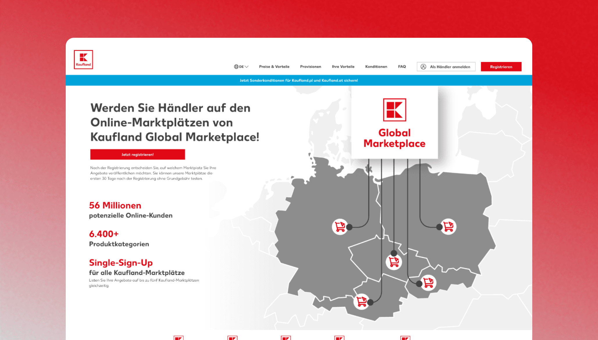
Updated Landing Page Design
The final design was aesthetically cleaner, with clearer navigation and user-focused improvements
Updated Landing Page Design
The final design was aesthetically cleaner, with clearer navigation and user-focused improvements
Updated Landing Page Design
The final design was aesthetically cleaner, with clearer navigation and user-focused improvements
Before & After
Compare versions below by clicking and sliding your over the images!
